How To Make Light Blue With Rgb?
Creating colors using the RGB (Red, Green, Blue) color model is an essential skill for graphic designers, digital artists, web developers, and anyone working in the realm of digital media or lighting. If you're wondering how to create a light blue color using RGB values, this detailed guide will walk you through the technical process, practical applications, and even touch on the nuances that affect how we perceive this specific hue in different contexts. Let’s dive into the science and artistry of RGB color blending to help you master the art of creating light blue tones.
Understanding the RGB Color Model
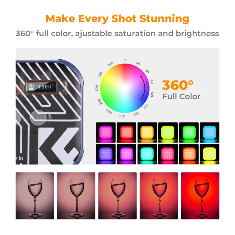
The RGB color model is an additive color system in which Red, Green, and Blue light are combined in varying intensities to create a range of colors. Each color channel has a value that ranges from 0 to 255. The more light that is added (higher values), the closer to white the resulting color becomes. Conversely, subtracting light (using lower values) creates darker colors, eventually reaching pure black when all values are set to zero.
The key to creating the color light blue lies in balancing the blue channel with moderate intensities of red and green. The aim is to produce a soft, pastel-like blue that exudes brightness and purity without veering toward darker or more saturated shades.
---
How to Mix Light Blue in RGB
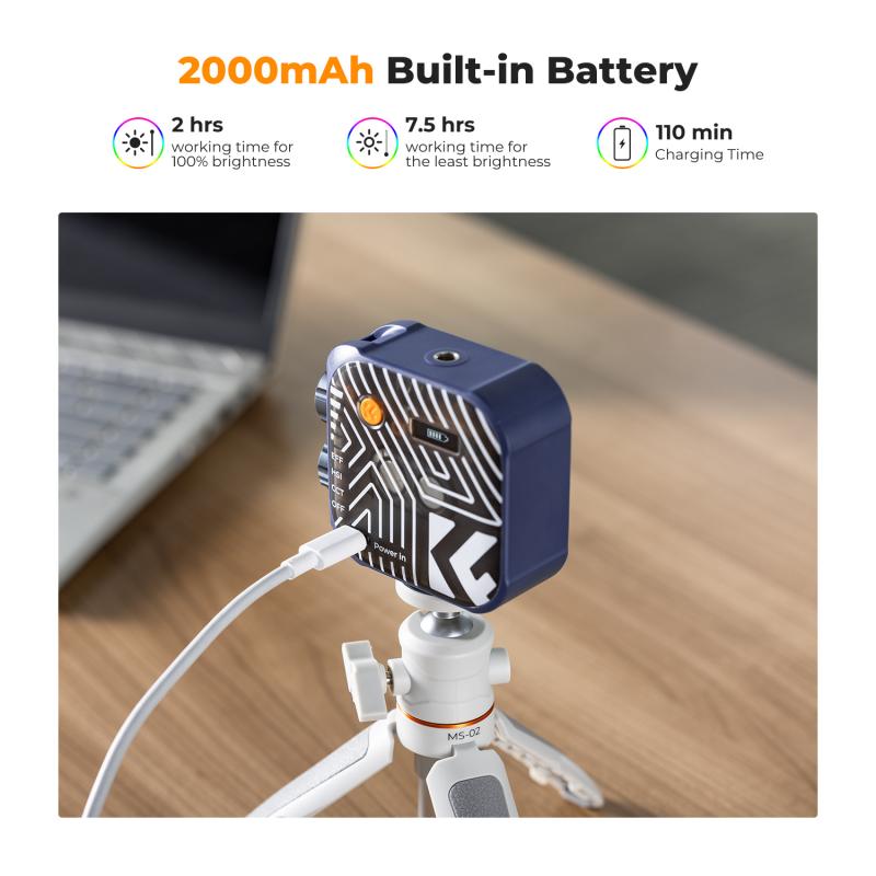
Creating light blue in RGB essentially involves boosting the blue channel above average while incorporating moderate amounts of red and green for balance. The standard RGB formula for a generic light blue is:
- R (Red): 173
- G (Green): 216
- B (Blue): 230
This combination creates a gentle, luminous blue that is pleasing to the eye. Here’s why these values work:
1. Blue (B): At a high value of 230, the blue channel dominates the mix. This creates the primary "blue" component for the final color.
2. Green (G): The green channel, at 216, adds brightness and a subtle greenish undertone. This helps the blue avoid a cold or overly harsh tone.
3. Red (R): At 173, the red channel is low but necessary to soften and warm the overall color, balancing it to prevent it from appearing overly sterile.
When these values are combined, they produce the soft, airy feel of light blue.
---
Customizing Light Blue for Different Needs

One of the great features of the RGB system is its flexibility. By tweaking the intensity of each channel, you can fine-tune the light blue to suit various designs, moods, or contexts. Below are some variations to consider:
1. Darker Light Blue: Reduce all the values proportionally. For example, use RGB (123, 176, 190). This creates a more muted and subdued tone suitable for formal designs or professional environments.
2. Brighter Light Blue: Increase all three values, keeping the proportions closer to the original. For example, RGB (190, 235, 245) results in a brighter, more luminous blue — perfect for children’s designs, pop art, or cheerful themes.
3. Teal-Tinted Light Blue: Add more green relative to red. For instance, RGB (150, 220, 230) produces a blue-green light blue, which can give a tropical and lively appearance.
4. Warmer Light Blue: Increase red slightly while keeping green and blue close to their original values. For example, RGB (185, 200, 230) introduces a small warmth to the hue.
---
Practical Tips for Using Light Blue in Design
The way light blue is perceived depends not only on its RGB composition but also on its application. Below are some industry-specific insights for working with light blue:
1. Website and UX Design
In web design, the psychological effects of colors cannot be overstated. Light blue is frequently associated with trust, calmness, and clarity, making it an excellent choice for backgrounds, call-to-action buttons, or feature highlights. Its airy nature ensures that text overlays, especially black or dark gray, remain highly readable.
However, ensure contrast compliance for accessibility. For instance, when using light blue as a background, avoid overlaying white or pastel text that might create low visibility for users with visual impairments.
2. Digital Artwork
Graphic artists often rely on light blue for creating skies, water, or reflective metallic surfaces. When working in programs like Adobe Photoshop or Illustrator, understanding RGB is essential for precise color adjustments. In programs that support color blending, consider adding layers with reduced opacity to achieve a textured or gradient effect.
3. LED and Lighting Design
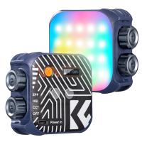
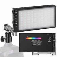
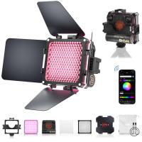
In lighting, RGB is used to produce actual light shades rather than just digital colors. A light blue glow can create a calming atmosphere in home settings, healthcare facilities, or even retail stores. Using the RGB values (173, 216, 230) directly in smart lighting systems or DMX-controlled devices can help you achieve the desired shade.
4. Print Media
Unfortunately, colors in print don’t directly translate from RGB. They rely on CMYK (Cyan, Magenta, Yellow, Black). You’ll need to convert RGB to CMYK, where light blue often becomes a mix of cyan and small amounts of magenta and yellow. Calibration of print settings and proofs is crucial to ensure your light blue appears accurately in physical designs.
---
Common Mistakes When Creating Light Blue
When working with RGB, even subtle errors can lead to undesired results. Below are some common pitfalls to watch out for:
1. Over-saturation: Pushing the blue channel to its maximum (255) while ignoring balance can create an overly bright, almost neon blue that lacks the subtlety of light blue.
2. Neglecting Color Context: Light blue can shift in appearance depending on surrounding colors. Always test your light blue over the background or adjacent colors where it will appear.
3. Ignoring Display Variance: Not all screens display colors the same way. Calibrate monitors if possible, and test your RGB light blue on multiple devices to ensure consistency.
4. Over-reliance on Exact Numbers: While RGB (173, 216, 230) is a strong starting point, it’s not a universal solution. Tweak values to adapt to specific situations or requirements.
---
The Science of Perception: Why We Love Light Blue
Light blue holds a unique spot in color psychology. It is often associated with feelings of tranquility, trustworthiness, and openness. This is why the color is prominently used in medical branding, water-related business logos, and tech companies striving for user trust. Moreover, its lighter tint makes it less imposing, which explains its popularity in casual wear or as a wall color for calming environments like nurseries and yoga studios.
Additionally, light blue resonates with themes of clarity and limitless possibilities — think clear skies and oceans. This universal familiarity makes it inherently appealing, no matter the cultural or regional context.
---
Mastering light blue in the RGB color model is less about memorizing a specific formula and more about understanding how color channels interact to create the desired hue. By using the foundational combination of RGB (173, 216, 230) and adjusting values based on context, you can achieve countless variations of light blue, from softer pastel hues to vibrant, glowing tones. Remember to keep in mind the project requirements — whether it’s web design, print, or lighting — so your light blue is optimized for its intended use.
As a versatile and generally well-loved color, light blue has the potential to transform visual experiences, evoke emotions, and elevate your designs. By applying the principles outlined here, you’ll be well on your way to embracing the subtle art of RGB color creation.

